The Observatory’s upgraded Data Hub comprises: the Data Explorer, which can be used to find the latest data direct from official sources; the Chart Builder, a step-by-step guide to creating embedded charts; and the Chart Sharer, a new forum for sharing your work and connecting with others.
We are pleased to announce the launch of our new Data Hub. The new tool is demand-driven, which means it’s all about you, the users. We have built two powerful and connected tools: a unified API that funnels live data from a range of national and international sources; and a chart-building workshop, where you can customise your visualisations.
We have also designed and created a new space – the Economics Observatory Chart Sharer – where you can post your work, like/save other users’ graphs, and comment on their work. We hope you enjoy it.
- Explore. Use the unified ECO API to access the latest data, pulled live from official sources. When the data are updated, so too will your numbers.
- Create. Build a visualisation using JavaScript, but with no coding skills needed. We’ve done the hard work for you. You just need to choose your favourite colours and add any notes and comments.
- Share. Post your visualisation onto a new data timeline. You will also be able to view, download, like and comment on other users’ work. Data visualisation is a collaborative discipline. Please get involved.
How to use the new hub
To make a chart, first click ‘Explore’. This will take you to our new ECO API. We have collected and combined a series of official data sources, modified the URL formats and funnelled them into one easy place – making this the ‘API of APIs’. Rather than having to visit the relevant sources for, say, Australia, Canada, the UK or the United States, you can find everything here in the dropdown menu.
Within the Data Explorer, you can toggle between different countries and variables. For example, you might choose to create a chart with ‘Great Britain’ and ‘unemployment’. There are lots of variables to choose from already, but please do let us know if there are any you’d like to see added (office@staging.economicsobservatory.com or @EconObservatory on Twitter).


After selecting your chosen country and variable, the URL link box will be automatically filled. In this example, ‘gbr’ represents Great Britain, and ‘unem’ means we are looking at the unemployment rate.
This URL links directly to the Office for National Statistics (ONS) data, live from its servers. When the new numbers come out each month, this link will pull through the latest figures, so you will never need to change it.
You can now scroll down to the ‘Create’ tool. You will notice that the boxes have already started to populate. The ECO API URL generated previously will be added to the data field in the top-left corner. You can already see how this will display in the chart on the right-hand side.
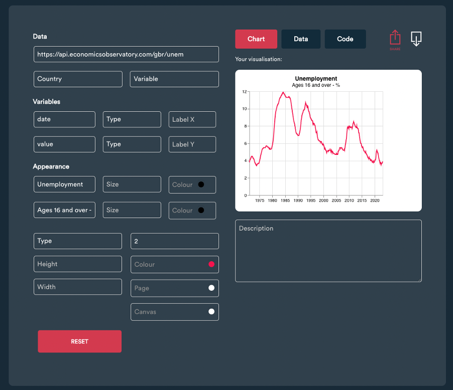
Now, you can play around and edit the various fields. You can change the colour and size of the line, or replace it with bars, points or a shaded area. You can tweak the title, change its colour and make amendments to the subtitle.
At this stage, you can also alter the overall size of the chart, and choose a background, both inside and outside the axis. You have full flexibility. If you want to return to the basic default settings, just click ‘Reset’. As a final step, you can also add some text to provide context.
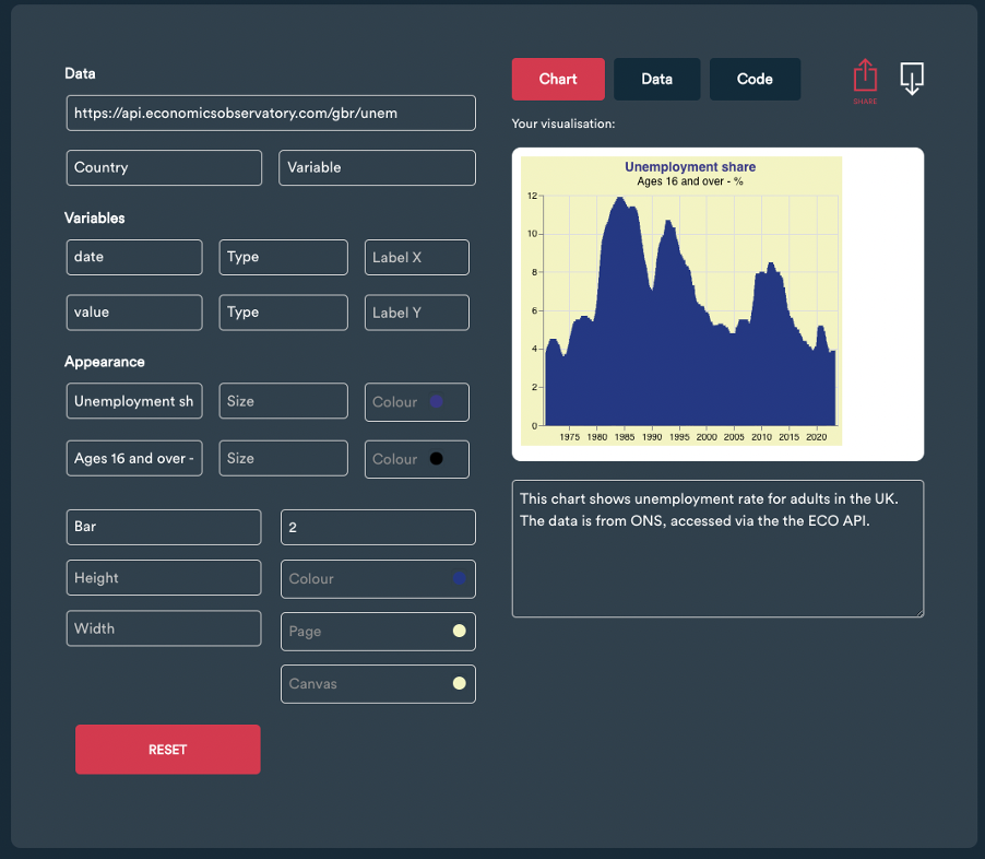
Having created your first chart, you can now download it as an image, explore the underlying data, or even look at the code behind the visualisation. Both the data and the code can be copied and pasted/saved elsewhere (in a personal GitHub repository, for example).

You can also share your visualisation to our new Chart Sharer timeline. To do so, click the red ‘Share’ icon in the top right-hand corner. If you don’t yet have an ECO account, you will be prompted to set up a free profile. This should only take a couple of minutes – we just need an email (for account verification), and for you to choose a username and password. If you already have an account, but aren’t logged in, you will need to log in before posting the chart. If you are already logged in, the chart will go straight into the timeline of new visualisations.
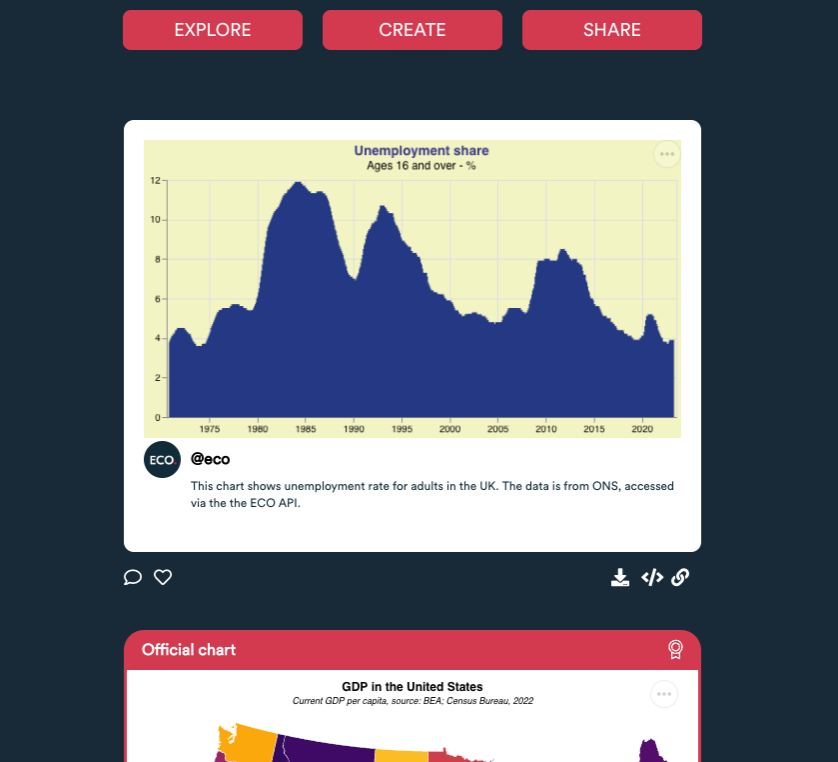
In the timeline, you can view your work, as well as like other people’s charts and leave them comments. You can also download copies or embed visualisations made by other users directly from the timeline.
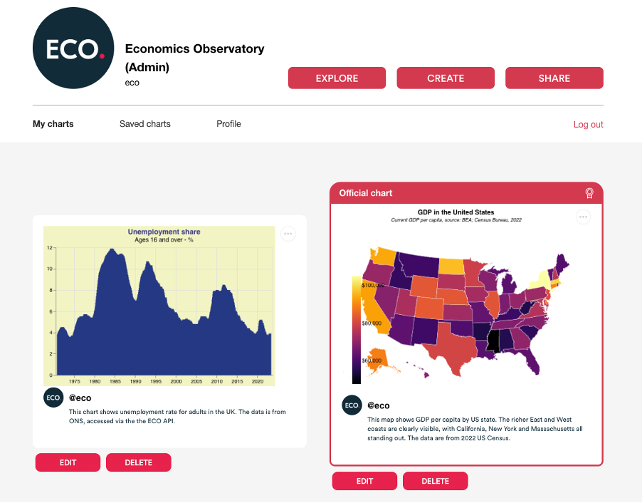
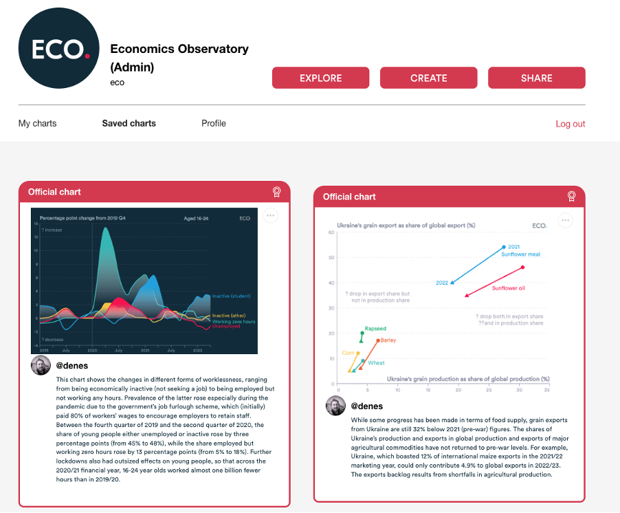
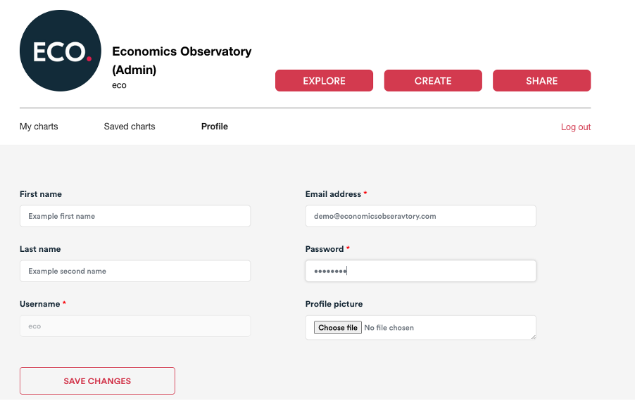
To keep a record of your own work, as well as other users’ charts you may have liked, click on your user icon in the top right-hand corner of the screen. Here you will see your account. You can view and edit your own work under ‘My charts’, see what posts you liked under ‘Saved charts’ and edit your personal information (including adding a profile picture using the ‘Profile’ tab).
We hope you enjoy using the new Economics Observatory Data Hub. It is still in its infancy, so we would appreciate any feedback you have on the user experience.
For now, please explore the data, try creating something that you like and then share it with the community. We look forward to seeing your ideas.


